We give you a preview of the new KDE Plasma Overview Effect. Here’s how it looks, and our opinion around it.

Some interesting changes are planned as of writing this post for the KDE Plasma 5.24 release. One of the important update is the new way of looking at your Plasma Activities and Virtual Desktops. The changes are still in development, but we get a glimpse of it and here are the details.
Table of Contents
Activities and Virtual Desktop in Plasma
In KDE Plasma, the activities and workspaces/virtual desktop are two different concepts. Often they feel similar, and many users use them together to make a productive working system.
Activities are a list of tasks, projects or widgets which you can define. And you can turn off/turn on, stop tracking those activities together when defined properly.
On the other hand, the Virtual desktops are separate workspaces which you can create. And switch between then using CTRL + F1, F2,…so on. They can have their separate open applications and Activities.
It’s a little confusing, but they are an excellent productivity booster if configured properly.
For example, say, you want to create three workspaces – one for gaming, one for watching movies and another for development. You can define separate activities and widgets for each of virtual desktops. For gaming, say, you might want a separate task bar or panel with only specific widgets. Or, for development, you might want to have a separate list of daemon or server to run when that activities activated.
In those scenarios, they are super effective when used together.
The New KDE Plasma Overview Screen
Today (as of Plasma 5.23), there is no such option to view the Virtual desktops, open windows and search together in KDE Plasma. There are widgets that can achieve this via activities. But they serve only one single purpose.
The new KWin effect or Overview screen is changing all of that.
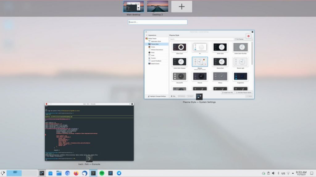
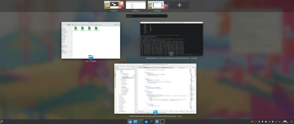
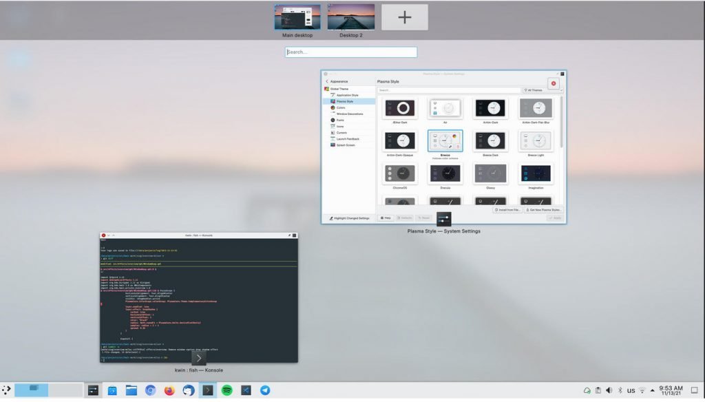
As per the merge requests in GitLab, the new overview screen will be a full-screen view. It features the list of virtual desktop as thumbnails at the top, with an option to add more. At the middle section of the overview screen, you can see the list of open windows of the selected virtual desktop.
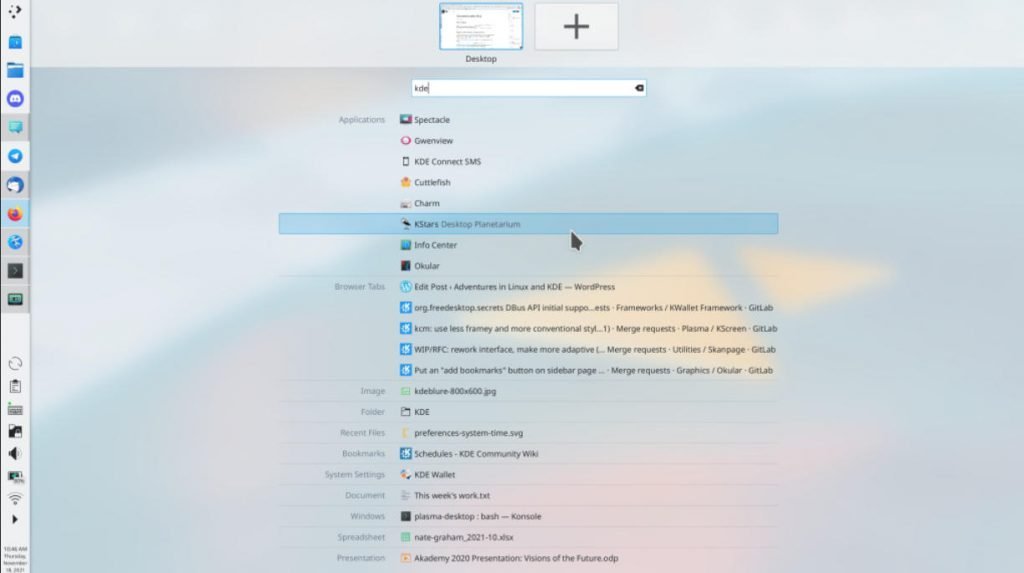
Between the list of virtual desktop and open windows, you have search bar. The search is expected to mimic the KRunner type search, which find files/shortcuts across your desktop. The Search happens on the fly. Search is done across your desktop – that is – applications, files, browser tabs, documents – everything. I am not sure whether it searches the file contents, thought which I need to test.
When you start typing in the search bar, the open windows expected to go away – although I am not sure of that.
However, look at the below screenshots from development versions from GitLab.


All these effects are part of multiple merge requests as per below.
- https://invent.kde.org/plasma/kwin/-/merge_requests/1688
- https://invent.kde.org/plasma/kwin/-/merge_requests/1668
- https://invent.kde.org/plasma/kwin/-/merge_requests/1642
- https://invent.kde.org/plasma/kwin/-/commit/195de46c9156584afee3283c7efe97dd400244bc
The above features are yet to land in the unstable version as of writing this. So, wait until the BETA of this version of KDE Plasma to experience it.
Performance
I am little skeptical about the performance of overall Plasma Desktop after this implementation. Think about KRunner. It’s one of the best Linux desktop launcher – hands down. But in my personal opinion, KRunner takes around 3 to 4 seconds to launch in all types of hardware. Not sure about you, but I always felt that.
Now with that included in KDE’s new overview – the entire response of the switching to overview effects, transition to apps, new view – not sure how it’s going to pan out. I hope it comes out better and not so laggy.
Do we really need this in Plasma?
Let’s think about GNOME 40 for a moment. You may have already noticed, that new Overview effects are similar to the GNOME’s. The only difference is GNOME shows the icons of the applications as an additional screen as part of Overview effects.
I am not going to lie, the GNOME’s overview (except that large icon screen) is very much productive UI design. And I am glad that KDE Plasma is bringing this with the power of KRunner. There is no harm in adopting something that is good, right? It is well accepted and tested.
And I believe this would make KDE Plasma more intuitive on a mission to become the greatest Linux desktop ever.
So, what do you think about this change? Let the conversation going in the comment box below!
Cheers.